Brand manual
How CAPO Health looks, sounds and gets used. Every piece in this document comes from the brand's original artwork — nothing redrawn, nothing approximated.
01 — The brand
Healthcare, connected.
CAPO Health connects a person with a genuinely licensed provider, online, with no waiting rooms. The brand has to sound like that: clinical but close, serious without hospital coldness.
The name
Capo means chief, captain, the one who leads. Applied to health it isn't dominance: it's taking charge of your own health, with a clinical team behind you. The blue wave crossing the wordmark is that guidance — the movement connecting the starting point to the destination.
02 — Logo
Primary version
This is the logo. Use it whenever there is room and a light background. Never retype it — always use the file.

03 — Anatomy
The four pieces
- 1CAPO wordmark — extended geometric, in navy. It is the fixed element of the brand, and its A is where the symbol comes from.
- 2The wave — crosses the wordmark between the C and the P, in cyan. It never leaves the wordmark except in the symbol, where it accompanies the A.
- 3HEALTH — widely letterspaced, in cyan. It is what turns CAPO into a health brand.
- 4Tagline — “HEALTHCARE, CONNECTED.” in navy, between two rules. Optional: drop it when the size makes it illegible.
04 — Variants
One for every background
Always pick the one that guarantees contrast. When torn between two, the higher-contrast one wins.



05 — Lockups and symbol
When the horizontal doesn't fit
Built from the same outlines as the official logo, simply regrouped. The symbol is the A of the wordmark — the letter the wave crosses, where the brand's gesture lives.








06 — Alternatives
Other options on the table
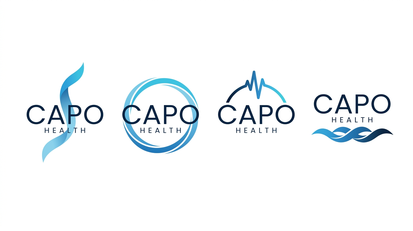
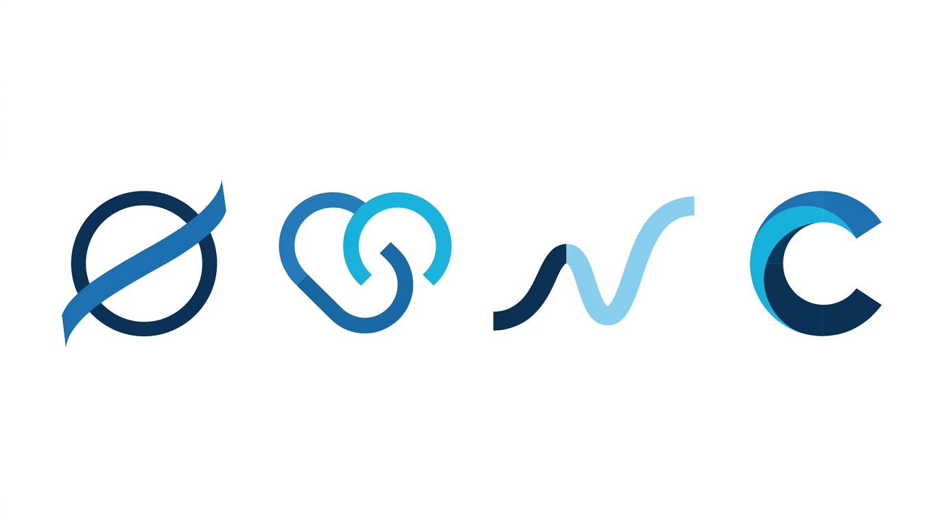
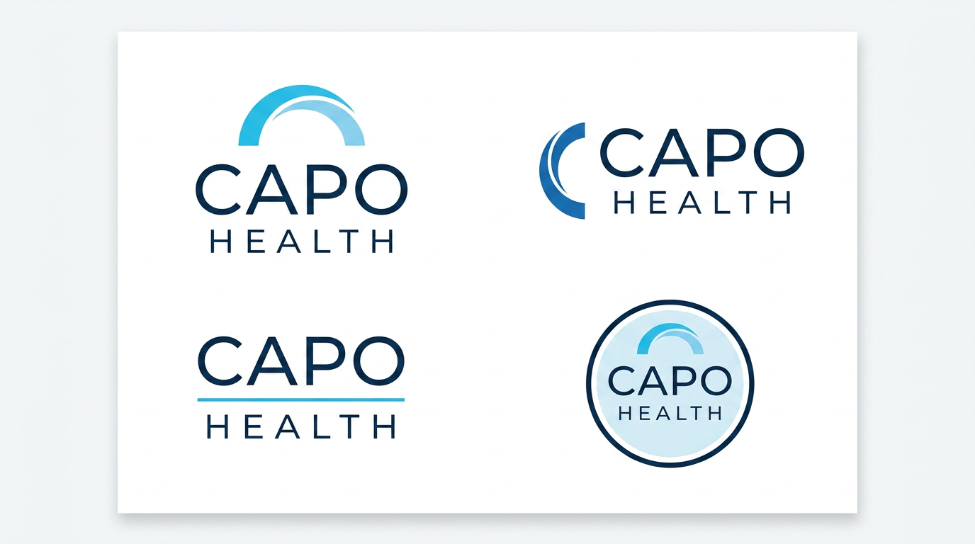
To decide togetherThe system on the previous pages is our recommendation, but it isn't the only route. These are three alternative directions, each with four variants, in case CAPO wants to take the brand somewhere else.
07 — Clear space and sizes
Let it breathe
Clear space equals the height of the O in the wordmark, applied on all four sides. Nothing enters that zone: no text, no other logo, no edge of the format, no graphic element.
Minimum sizes
| Version | Digital | |
|---|---|---|
| Primary with tagline | 200 px wide | 45 mm |
| Without tagline | 120 px wide | 28 mm |
| Symbol | 24 px | 8 mm |
08 — Misuse
What breaks the brand
Every example here is real: these are the mistakes that show up most often once a logo starts circulating between teams.
09 — Colour
Two colours make the brand
Navy and cyan come straight from the official artwork. Everything else is support, and exists only so those two work.
Brand colours
#1F2C50 · rgb(31,44,80) · cmyk 96/85/38/32 · Pantone 2767 C approx.Wordmark, headlines, body copy, contrast backgrounds.
#37A1DB · rgb(55,161,219) · cmyk 71/25/0/0 · Pantone 2925 C approx.The wave, HEALTH, accents, buttons, icons, links.
Navy scale
Cyan scale
Neutrals and semantics
Proportion
10 — Accessibility
Cyan doesn't work for small text
Contrast measured against WCAG 2.1. This isn't opinion — these are the numbers.
| Combination | Ratio | Result | Where it can be used |
|---|---|---|---|
| Navy on white | 13.69 : 1 | AAA | Any text, any size |
| White on navy | 13.69 : 1 | AAA | Any text, any size |
| Light cyan #8FCDEE on navy | 7.91 : 1 | AAA | Secondary text on dark backgrounds |
| Cyan on navy | 4.75 : 1 | AA | Normal text on navy. Not for thin grey |
| Navy on cyan | 4.75 : 1 | AA | Buttons with navy text on cyan |
| Grey #5A6B80 on white | 5.46 : 1 | AA | Secondary text and descriptions |
| Cyan on white | 2.88 : 1 | Fails | Graphic elements and the logo only. Never text |
| White on cyan | 2.88 : 1 | Fails | Graphic elements only. Never text |
11 — Typography
Poppins and Inter
The wordmark is unique and comes outlined. For everything else, two free Google Fonts families that match its geometry.
Geometric, with an almost circular O. It is the closest match to the wordmark. Headlines, figures and brand elements.
High legibility at small sizes, tabular figures, excellent screen rendering. All body copy, forms and clinical data.
Type scale
letter-spacing: .22em
in uppercase, echoing the rhythm of HEALTH in the logo. It is the typographic gesture
that identifies CAPO most, after the logo itself.
12 — Voice and tone
Clinical, direct, no promises
Do
| “A licensed provider reviews your case and decides whether treatment is appropriate.” |
| “Not everyone qualifies.” |
| “Individual results vary.” |
| “If it isn't right for you, we'll tell you and explain why.” |
| “Your provider confirms the final price after the review.” |
Don't
| “Lose 20 lb in 3 months.” — a promised number |
| “The same medication as Ozempic®.” — false and risky |
| “FDA approved.” — compounded drugs are not |
| “Guaranteed.” — nothing is |
| “No prescription / no consultation needed.” — contradicts the model |
13 — Applications
The brand in use
Profiles and favicon
capo-health.pages.dev CAPO Health — Healthcare, connected.Stationery
email · phone

Digital
connected.
is ready.
14 — Compliance
What is not negotiable
CAPO Health operates in GLP-1 telehealth in the United States. These lines travel with the brand on every public piece. They are not decorative legal text — they are the condition for being able to publish at all.
| Element | Obligation |
|---|---|
| Prescription | Only after review by an independent licensed provider. Always state that not everyone qualifies and that nothing is guaranteed. |
| Compounded drugs | “Compounded, not approved by the FDA.” Not equivalent to Ozempic®, Wegovy®, Mounjaro® or Zepbound®. No affiliation with Novo Nordisk or Eli Lilly. |
| Results | “Individual results vary” repeated. Weight figures always labelled illustrative and sourced from published literature, never from CAPO patients. |
| Pricing | A disclaimer under every price: the provider confirms plan, dose and final price after the review. |
| Legal identity | “CAPO Health is not a pharmacy and does not practice medicine.” Pharmacies and medical group named with their licences. |
| States | 44 asynchronous + 7 requiring a synchronous consultation (DC, KS, LA, MS, NM, RI, WV). Verify before every campaign. |
| Data | No PHI on public surfaces. Intake lives in the HIPAA portal. |
| Footer | Terms · Privacy · HIPAA Notice · Telehealth Consent · State Availability · Refund. |
noindex.
15 — Files
What to use and when
The package ships with every version in SVG and in PNG at 2400 px with a transparent background. The SVG is the source of truth; the PNGs are exports.
logo-capo-health-ORIGINAL.svgArtwork exactly as delivered. Never edited — this is the master.principal.svgFull version cropped to its content. The everyday one.principal-sin-tagline.svgFor medium sizes and navigation bars.reverse.svg On navy or dark backgrounds.mono-navy.svg · mono-blanco.svg · mono-cyan.svgSingle ink.lockup-vertical.svg · lockup-horizontal.svgAlternative compositions with the symbol.isotipo.svg · isotipo-onda.svgThe A. Without the wave below 40 px, with it above.badge-navy.svg · badge-blanco.svgCircular crop: avatars and app icons.Live links
| Landing page | capo-health.pages.dev — with noindex |
| This manual | Updated with every brand version. Version 1.0. |
CAPO Health · Brand manual v1.0 · 7 September 2026 · Prepared by ONCE ONCE Agency.